1. Getting Data
This dashboard uses the food price inflation data from Eurostat, which tracks the Harmonised Index of Consumer Prices (HICP) - the percentage change over time in the good prices paid across different European countries. t is straightforward to get the data since the website of European statistics offers the API to access the data which is in a CSV format. You can directly read the CSV from a Web URL and put it in a data frame format. The following block of code can be used to get access to data and do some processing before the visualizations.
def get_data(url):
    # get data from api
    df = pd.read_csv(url)

    df = df[(df["indx"] == "HICP") & (df["unit"] == "PCH_M12")]
    df = df.rename(
        {"TIME_PERIOD": "period", "OBS_VALUE": "Percentage change m/m-12"}, axis=1
    )
    coicop_label = {
        "Food": "CP011",
        "Bread and cereals": "CP0111",
        "Bread": "CP01113",
        "Meat": "CP0112",
        "Beef and veal": "CP01121",
        "Pork": "CP01122",
        "Lamb and goat": "CP01123",
        "Poultry": "CP01124",
        "Fish and seafood": "CP0113",
        "Milk. Cheese and eggs": "CP0114",
        "Fresh whole milk": "CP01141",
        "Yogurt": "CP01144",
        "Cheese and curd": "CP01145",
        "Eggs": "CP01147",
        "Oils and fats": "CP0115",
        "Butter": "CP01151",
        "Olive oil": "CP01153",
        "Other dible oils": "CP01154",
        "Fruit": "CP0116",
        "Vegetables": "CP0117",
        "Potatoes": "CP01174",
        "Sugar": "CP01181",
        "Coffee, tea and cocoa": "CP0121",
        "Fruit and vegetables juices": "CP01223",
        "Wine from grapes": "CP02121",
        "Beer": "CP02123",
    }
    coicop_label = pd.DataFrame.from_dict(coicop_label, orient="index")
    coicop_label = coicop_label.reset_index().rename(
        {"index": "label", 0: "coicop"}, axis=1
    )
    df = df.merge(coicop_label, left_on="coicop", right_on="coicop", how="left")
    df = df[df["label"].notnull()]

		countries = [
        {
            "Country": country.name,
            "alpha_2": country.alpha_2,
            "alpha_3": country.alpha_3,
        }
        for country in pycountry.countries
    ]
    df.rename({"Country_name": "Country"}, axis=1)
    countries = pd.DataFrame(countries)
    df = df.merge(countries, left_on="geo", right_on="alpha_2", how="left")
    df = df[
        [
            "period",
            "indx",
            "Percentage change m/m-12",
            "coicop",
            "Country",
            "alpha_2",
            "geo",
            "alpha_3",
            "label",
        ]
    ]
    return df

df = get_data(
    "<https://ec.europa.eu/eurostat/databrowser-backend/api/extraction/1.0/LIVE/true/sdmx/csv/PRC_FSC_IDX?i&compressed=false>"
)
2. Build the interactive dashboard app
We will use the Python Plotly library which is well known for Interactive Visualization for R and Python to visualize the data. The interactive dashboard app will be created using Dash - a popular Python-based web framework for developing data visualization applications.
2.1 Create the Visualization
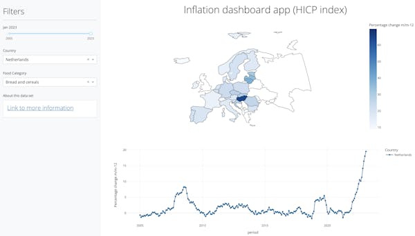
All the graphs in the dash application are created from the Plotly library. For this dashboard, we will create two figures: a Choropleth map that compares the price changes among different European countries at a certain period of time and a line plot that shows how the price changes over time for each country.
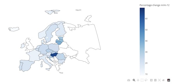
Create the Choropleth Map
First, we will create a Choropleth map that uses the intensity of color to correspond to a summary of a geographic characteristic within a spatial unit, such as the inflation rate for a certain country.
To create the interactive choropleth map, we can use the function plotly.express.choropleth() from plotly.express module. This function receives a data frame as input, and you need to specify at least 2 parameters: color and location. The value for the “color” parameter specifies the column in the df that contains the data to be visualized on the map, with the color of each country corresponding to the data value. The value for locations is used to match the countries to their respective shapes on the map. With more arguments for cosmetic improvements, the interactive choropleth map is here!
fig_world_map = px.choropleth(
        df[mask].dropna(subset=["Percentage change m/m-12"]),
        locations="alpha_3",
        color="Percentage change m/m-12",
        hover_name="Country",
        featureidkey="properties.ISO_A3",
        projection="natural earth",
        scope="europe",
        color_continuous_scale=px.colors.sequential.Blues,
        # width=500, height=400
    )
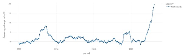
Create the line plot
Next, we want to see how the price changes over the course of time, which is why we are going to create a line plot using plotly.express.line .This function sets the x-axis to the "period" column and the y-axis to the "Percentage change m/m-12" column from the data frame.
fig_line = px.line(
        df_tmp,
        x="period",
        y="Percentage change m/m-12",
        color="Country",
        markers=True,
        symbol="Country",
    )
2.2 Build the Dashboard App
Dash Component
There are two fundamental aspects of a Dash application:
- Layout
- Interactivity (Callbacks)
Layout
The layout describes the physical components of the application and what the app should look like. There are three broad types of layout components - HTML elements, CSS elements, and dash components.
- Dash HTML Components - nearly all regular HTML components
- Dash core components (
dash.dcc) combine multiple HTML elements, CSS, and JavaScript into a single component. Examples of these include interactive widget such as dropdown menus, checklists and sliders. - Dash Bootstrap Components (
dash.dbc) has many components for dash that are built using Bootstrap, a very popular CSS and JavaScript library containing styled HTML components e.g, dbc.Row and the dbc.Column component.
Interactivity (Callbacks)
Interactivity is the code that makes changes to the layout components when a particular event occurs. Any event that occurs within a dash application can be mapped to some functions that change one of the layout components. For example, when a country is selected in a dropdown, the graph updates to show the chosen country’s information.
The app callback method decorates the function and takes two main arguments: – Outputs - A list of layout components to be changed when an event happens – Inputs - A list of layout components that trigger the function. It listens to changes in the value of the active cell made by the users.
Ok enough theory, let’s create the app.
Build the dash app
Create the layout
The first part of the code starts with defining a nicely-looking sidebar element that will contain all the input widgets that allow the user to select specific options to update the data presented in the main content area of the dashboard. We start by defining a dictionary called SIDEBAR_STYLE, which specifies the styling for the sidebar of the dashboard using some CSS properties such as top, left, bottom, height, padding, and background-color.
SIDEBAR_STYLE = {
    "top": 0,
    "left": 0,
    "bottom": 0,
    "height": "100%",
    "padding": "2rem 1rem",
    "background-color": "#f8f9fa",
}
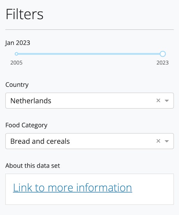
Next, the code creates a sidebar div element using the html.Div method from the dash_core_components module. The sidebar contains a title, a horizontal line, and several input controls that allow the user to filter the data by date, country, and food category. The input controls include a slider (dcc.Slider), two dropdown menus (dcc.Dropdown), and a card (dbc.Card) that provides additional information about the dataset.
sidebar = html.Div(
    [
        html.H2("Filters"),
        html.Hr(),
        dbc.Nav(
            [
                html_slider,
                html_dropdown_country,
                html_dropdown_foodcategory,
                html_about,
            ],
            vertical=True,
            pills=True,
        ),
    ],
    style=SIDEBAR_STYLE,
)
The above code should return the following:
Let’s also add a title element using the html.H2 method, which displays a title for the dashboard.
title = html.H2(
    "Food price monitoring tool - the harmonised index of consumer prices (HICP)",
    style={"text-align": "center"},
)
The input controls are defined inside the four components of the navigation, html_slider, html_dropdown_country, html_dropdown_foodcategory and html_about.
html_slider = html.Div(
    [
        dbc.Label("Date", id="slider_label"),
        dcc.Slider(
            id="slider_year",
            min=years[0],
            max=years[-1],
            marks={int(year): str(year) for year in [years[0], years[-1]]},
            step=1 / 12,
            value=2022.25,
        ),
        html.Br(),
    ]
)

html_dropdown_country = html.Div(
    [
        dbc.Label("Country"),
        dcc.Dropdown(
            id="dropdown_country",
            options=[{"value": x, "label": x} for x in df["Country"].unique()],
            value="Netherlands",
        ),
        html.Br(),
    ],
)

html_dropdown_foodcategory = html.Div(
    [
        dbc.Label("Food Category"),
        dcc.Dropdown(
            id="dropdown_food_category",
            options=[{"value": x, "label": x} for x in df["label"].unique()],
            value="Bread and cereals",
        ),
        html.Br(),
    ],
)

html_about = html.Div(
    [
        dbc.Label("About this data set"),
        dbc.Card(
            [
                dbc.CardBody(
                    [
                        html.H4(
                            id="card_title_3",
                            children=[
                                html.A(
                                    "Link to more information",
                                    href="<https://ec.europa.eu/eurostat/cache/metadata/en/prc_fsc_idx_esms.htm>",
                                    style={},
                                )
                            ],
                            className="card-title",
                        ),
                    ]
                ),
            ]
        ),
    ]
)
Now that the sidebar is ready, we move on to the more interesting part of the dashboard, the actual world map and line graph that we created before. The dash.dccmodule includes a Graph component called dcc.Graph to render any plotly-powered data visualization. In the code, we define these two elements as
html_world_map = html.Div(
    dcc.Graph(id="choropleth"),
)

html_line_graph = html.Div(
    dcc.Graph(id="line"),
)
These two Graph elements for the choropleth map and the line plot will be dynamically created and updated further below. Finally, we will create a layout div element that contains the whole dashboard: a sidebar column on the left and a main column containing the graphs on the right. The main column contains the world_map and line_graph elements. The layout variable contains all the information on how the dashboard will be laid out and will be used by the dash app.
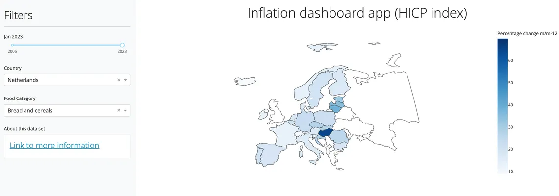
html_center = html.Div(
    [
        html.Center(
            html.H1("Inflation dashboard app (HICP index)"),
            style={"margin-bottom": "20px", "margin-top": "20px"},
        ),
        dbc.Row(
            [
                dbc.Col(
                    [
                        dbc.Row(
                            [
                                dbc.Col(
                                    html_world_map,
                                    width=12,
                                ),
                                dbc.Col(
                                    html_line_graph,
                                    width=12,
                                ),
                            ],
                            style={
                                "margin-right": "20px",
                            },
                        ),
                    ]
                ),
            ]
        ),
    ],
)

layout = html.Div(dbc.Row([dbc.Col(sidebar, width=3), dbc.Col(html_center, width=9)]))
Interactivity (Callbacks)
The layout of our dashboard is now complete. We are ready to move on to the second half of our application, the interactivity. The interactivity is captured by user-defined functions that get triggered by some events on the dashboard, e.g. a click.
The first callback function update_slider_label will listen to changes made by the slider in the sidebar. When the user drags the slider to the left and right, the label appearing at the top of the slider will update to display the date that corresponds to the slider. Components that we listen to and components that are to be updated are captured by the objects Output and Input inside the callback decorator. The value of the slider is passed to the update_slider_labelfunction as the periodargument and converted and returned to a readable string.
@dash_app.callback(
    Output(component_id="slider_label", component_property="children"),
    Input(component_id="slider_year", component_property="drag_value"),
)
def update_slider_label(period):
    if period:
        # convert e.g. 2020.25 to 'Mar 2020'
        year = int(period)
        index = int(np.round(12 * (period - year)))
        month = list(months.values())[index]

        return f"{month} {year}"
In the second callback function update_world_map , the output is the choropleth map figure. The input includes the year (from slider) and the dropdown widget to select the food category. Whenever either of these inputs changes, the update_world_map function will be called with the new values of the slider and dropdown to select food category. The function will then use these values to update data on a world map:
@dash_app.callback(
    Output(component_id="choropleth", component_property="figure"),
    Input(component_id="slider_year", component_property="drag_value"),
    Input(component_id="dropdown_food_category", component_property="value"),
)
def update_world_map(date, foodcategory):
    # convert e.g. 2002.25 to '2002-03'
    year = int(date)
    index = int(np.round(12 * (date - year)))
    month = list(months.keys())[index]
    period = f"{year}-{month}"

    mask = (period == df["period"]) & (foodcategory == df["label"])
    fig_world_map = px.choropleth(
        df[mask].dropna(subset=["Percentage change m/m-12"]),
        locations="alpha_3",
        color="Percentage change m/m-12",
        hover_name="Country",
        featureidkey="properties.ISO_A3",
        projection="natural earth",
        scope="europe",
        color_continuous_scale=px.colors.sequential.Blues
    )
    fig_world_map.update_layout(
        autosize=False,
        margin=dict(l=0, r=0, b=0, t=0, pad=4, autoexpand=True),
    )
    return fig_world_map
In the third callback function update_line_plot, the function receives two inputs which are the dropdown_country****and ****dropdown_food_category ****. Whenever either of these drop-downs is updated, the update_line_plot function will be called with the new values of the drop-downs as the country and food_labelarguments to update and return the line plot:
@dash_app.callback(
    # Set the input and output of the callback to link the dropdown to the graph
    Output(component_id="line", component_property="figure"),
    Input(component_id="dropdown_country", component_property="value"),
    Input(component_id="dropdown_food_category", component_property="value"),
)
def update_line_plot(country, food_label):
    if country:
        mask = (df["Country"] == country) & (df["label"] == food_label)
        df_tmp = df[mask]
    else:
        mask = df["label"] == food_label
        df_tmp = df[mask]

    fig_line = px.line(
        df_tmp,
        x="period",
        y="Percentage change m/m-12",
        color="Country",
        markers=True,
        symbol="Country"
    )

    return fig_line
Voila, now the app is basically complete. By default, Dash apps run on localhost, which means you can access them on your machine. In your terminal, go to your project’s directory and go to the folder src - where the app.py file is located, and type the following: python app.py. What this command does is start the local development server that hosts your app on your machine. Now if you go to your browser: http://127.0.0.1:8050/, you should see your app there:
3. Deploy the dashboard app in the Azure portal
It is nice to see your beautiful Dash app running locally, but it would be even more exciting if others could also see and interact with it over the web too! To share a Dash app, you need to deploy it to a server. We will use the Azure App service to host the web application.
The first step in hosting your web application is to create a web app inside your Azure subscription. There are several ways you can create a web app. You can use the Azure portal, the Azure CLI, or an IDE like Visual Studio. For this module, we'll demonstrate using the Azure portal, which is a graphical experience to deploy the dashboard app.
3.1 Prerequisites
To follow the steps in this how-to guide:
- If you don't have an Azure subscription, create an Azure free account before you begin. This will you give a $200 credit to explore Azure services.
- Have a Git repository with the code of the app you want to deploy. Make sure your Git repository contains the following files:
Requirement.txtfile that lists all the dependencies for your project. This is needed to tell Azure which libraries it needs to install in order to execute the code. You can use Pipregs to auto-generate the file based on the imports in your code. In your terminal, simply go to the location/path where you store the app.py file for your project and type “pipreqs .”. That’s it, a requirement.txt file is generated.Procfile, which is custom startup file to instruct Azure how to execute your code:
web: gunicorn --timeout 600 --chdir src app:server
In our case, this contains a gunicorn command which is used to receive requests from the web server and pass it down to the python application to process the request.
3.2 Step-by-step Guide to deploy the dashboard on Azure App Service
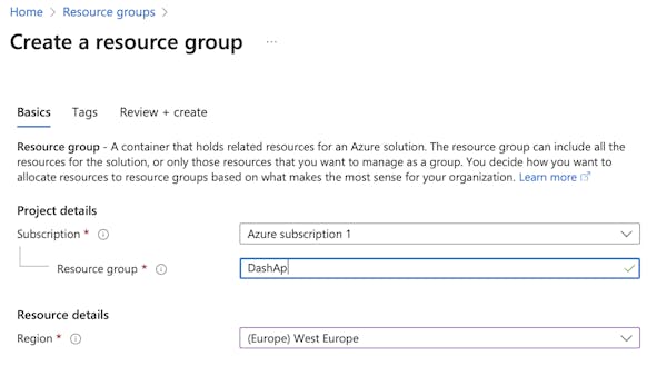
Step 1. Create resource group
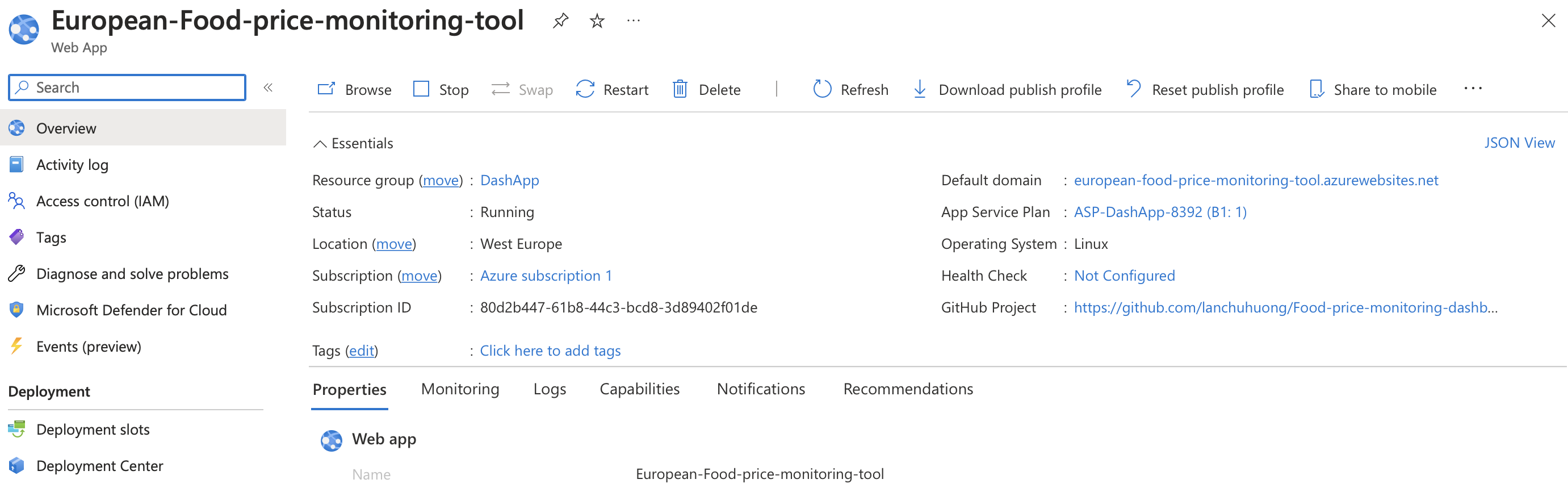
You will need a resource group to use any Azure services, so let’s create one first. We can create a resource group by navigating to the "Resource groups" page in the Azure portal and the following window will pop up. I am using my free Azure subscription and create a resource group called “DashApp”.
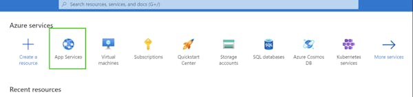
Step 2. Create Web App service
After the resource group is created, the next step is to create a web app service. Azure App Service is a fully managed web app hosting platform that takes care of the infrastructure to run and scale web applications. The Azure portal provides CI/CD with Azure DevOps, GitHub, or a local Git repository on your machine. Connect your web app with any of the above sources, and App Service will do the rest for you by automatically syncing your code and any future changes to the code will be deployed to the web app.
You can create the web app services by navigating to the "Create a resource" page in the Azure portal, searching for "Web App" and following the prompts to create a new app. Fill in the name of the app and select the appropriate runtime stacks e.g. the version of python you are using for your repository and leave other settings as default.
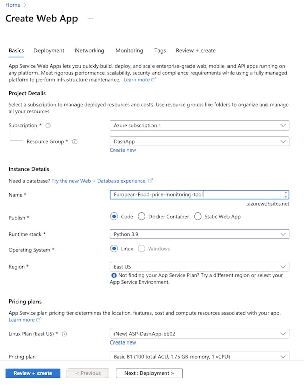
Select Review + Create to go to the Review pane, and then select Create. It can take a moment for deployment to complete.
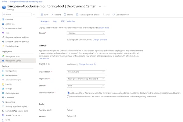
Step 3. Configure the deployment settings
When deployment is complete, we need to configure the deployment settings for your app. In this case, I will use GitHub to host my web app. All we need to do is to link the deployment settings to the correct git repository and branch. Once the deployment settings are configured, Azure will automatically deploy your app from your GitHub repository.
Voila, you can now navigate to your Web App and use the URL to see your deployed dashboard app in action! Congratulations!!